In with the new, and out with the old. As we creep into a new decade of Mobile UI and Web Design, the team at Raft sat down to select our favorite trends from across the web.
Menus
OUT: Hamburger Menus
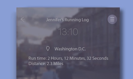
The Hamburger menu is a staple of UI design, so old it can legally drink. In this age of minimalist design, it’s seen a rise in popularity because it neatly tucks everything away, leaving the user with an uncluttered UI. Unfortunately, it’s a little too clean, leaving the user aimlessly searching on a nearly blank screen to make their first input. As phone screens grow larger in size and higher in definition, users find it harder to touch the top part of their screen. Often times these buttons are usually placed in the same location as the standard mobile navigation back button, creating a clash of UI elements.
IN: Tab Bar
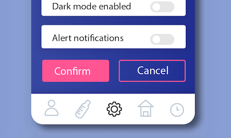
A tabbed navigation bar is a great alternative to a hamburger menu. Having your key navigation elements clearly visible on the home screen, signals their importance. It also drives users to discover features organically, while giving them a navigational tool, ensuring that they’ll never get lost.
Interaction Locations
OUT: Top Third of the Screen
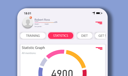
Previous mobile UI designs reserved user interactions for the top third of the screen, assuming that most users interact with apps like their books, reading first from top to bottom. However given the recent size increase of phone screens, the top third of most devices has steadily extended beyond the reach of most human hands.
IN: Bottom Third of the Screen
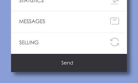
While we wait for our fingers to grow to accommodate larger screens, designing for the ‘reachable area’ of the screen has become imperative. Facebook, Flipagram, Buffer, have already noticed this trend and reserve primary menus for the lower third of the screen. By keeping these key user actions within thumb range you give users access to the holy grail of functionality, one-handed navigation.
Listing Items
OUT: Carousels
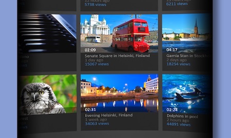
The UI industry as a whole has finally broken up their love affair with carousels. Carousels are counterintuitive, requiring UI signposts like arrows, mirror illusions, dots, and lines to prompt users to interact with them. They can also limit discoverability due to sequential access, and seemingly endless listings may create user fatigue. (If you’ve ever swiped aimlessly through a random collection of movies on Netflix, you know what we mean.)
IN: Card UI
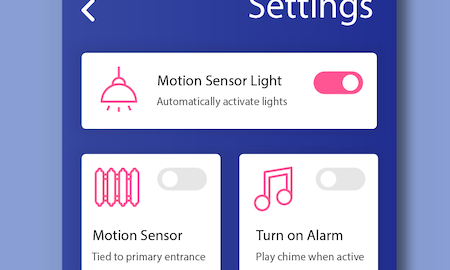
With the rise in popularity of material design, developers are literally putting all their cards on the table. Cards display lists as clean, uniform containers spread out evenly across the UI. When designed well, cards present information in small bite-sized chunks, inviting engagement and helping users quickly navigate their options. Although cards increase the depth of scroll, they create a more impactful experience by grouping eye-catching imagery, descriptive text, and associated interactions. Cards are easy to scale, integrate well with the atomic design systems, and allow for a much wider spectrum of screen interaction, including swiping, scrolling, tapping and clicking.
Contact Us
If you’re interested in designing a Native App or Progressive Web App, our team of UX gurus have their fingers on the pulse of the mobile development community. Reach out to us at [email protected].


