Beyond Compliance: Improving USWDS Accessibility
July 7, 2021 | Words by Miles Reiter
The U.S. Web Design System (USWDS) represents a great starting place for designing and building accessible experiences. Its components are built to from the ground up to be keyboard navigable, render with accessible contrast, and generally conform to easily recognizable patterns. It comes out of the box with a variety of development tools to help ensure accessibility while allowing for customization from project to project such as automatic contrast checks that run right in the code itself when you make a change to the color palette. But no matter how great the toolset supporting accessibility manual testing that takes the time to consider the diversity of ways in which something will be experienced is critical. Access to an experience is not always the same thing as equity of experience.
This brings us to implementing a file upload workflow as part of our project with the Administration for Children & Families’ Office of Family Assistance (OFA) involving a new data portal for the Temporary Assistance for Needy Families (TANF) program. Thanks to USWDS 2.0, we had a file input component to plug in to.
Like other components in the library, it’s built on the principle of progressive enhancement. Javascript and CSS adding value to a pure HTML core that can be fallen back upon in a scenario where javascript fails to initialize. It also has the benefit of relying on HTML markup that plays nice with screen readers and lets them recognize it for type of input it is.
At first glance our implementation of the component was looking good; behaving just like the USWDS demo. Files uploaded successfully and labels associated to each file input were read correctly by screen readers. But as we continued testing—moving from basic checks to those focused more on the overall quality of the experience—we started to identify some rough spots.
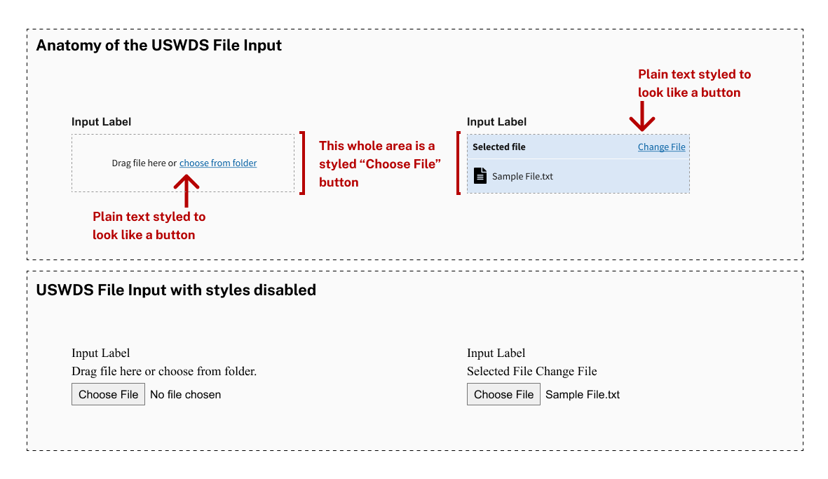
For one thing, what might visually appear to be a button (“Change File”) is really just a piece of text dressed up to look like a button. It’s not a tab stop, and depending on the browser interacting with it, can’t be read by screen readers without having them also read “Selected File” along with it. When it was read, it came with none of the usual calls to action or instructions that come with buttons, links or other interactive elements. It’s read as what it is; text.
“Selected File Change File. You are on a text element.”
More critically—especially so in our upload workflow where users are likely to return to file inputs in their attached file state—screen readers often won’t interact with the name of the selected file at all. When they do read it (as happens in Safari) it’s easy to miss and it lacks the context clues that a sighted user would get from the input.
“[Selected file name] [Input label] Button. You are on a button, to press this button…”
– As read by VoiceOver in Safari
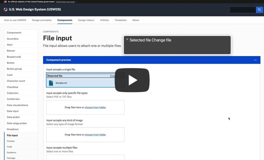
Demo: USWDS File Input Behavior
The lack of transparency into that selected file name isn’t an issue exclusive to the USWDS component. But regardless of where the issue stems from we needed a solution; one that didn’t require a change to the component itself due to a constraint of how USWDS is integrated to our project. Our solution? Doing what amounts to handing a script to the screen reader that it can read when interacting with the input.
The Steps
- Add hidden text to the upload page that would be programmatically updated based on file input labels and the file names uploaded to them.
- Give that hidden text a unique ID so that it can be referenced by other elements.
- Reference the ID in an ARIA-describeby property added to the file input.
The Results
When focused, the file input will now pass the describeby text to the screenreader so that it gets read alongside the label and the input type. In our case this resulted in the slightly longer, but far clearer result below.
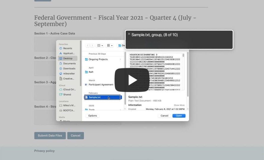
“Section 1 - Active Case Data. Selected File: “Sample.txt”. Click to change the selected file. You are on a button, to press this button…”
– As read by VoiceOver in Chrome
Demo: Raft File Input Behavior
Takeaways
- Taking the time to think through the many different ways people will experience what you create is essential to accessibility testing. There’s lots to consider; from information conveyed to people relying on screen readers to proximity of related content for folks with a limited field of view and properly sized interaction targets for those with dexterity problems.
- While there’s a lot that can be caught by internal manual testing, but there’s no substitute for inclusive research; making sure your designs get tested by people with disabilities.
- You may not always have the opportunity to rebuild certain components, but there’s a lot that can be done around components to enhance their degree of accessibility; much of it quick and easy to add.